This week's challenge is to improve a data visualization that was published in an article from thrillist. It shows a comparison of the cost of a night out in selected cities around the world. The data is available on data.world
The original visualization
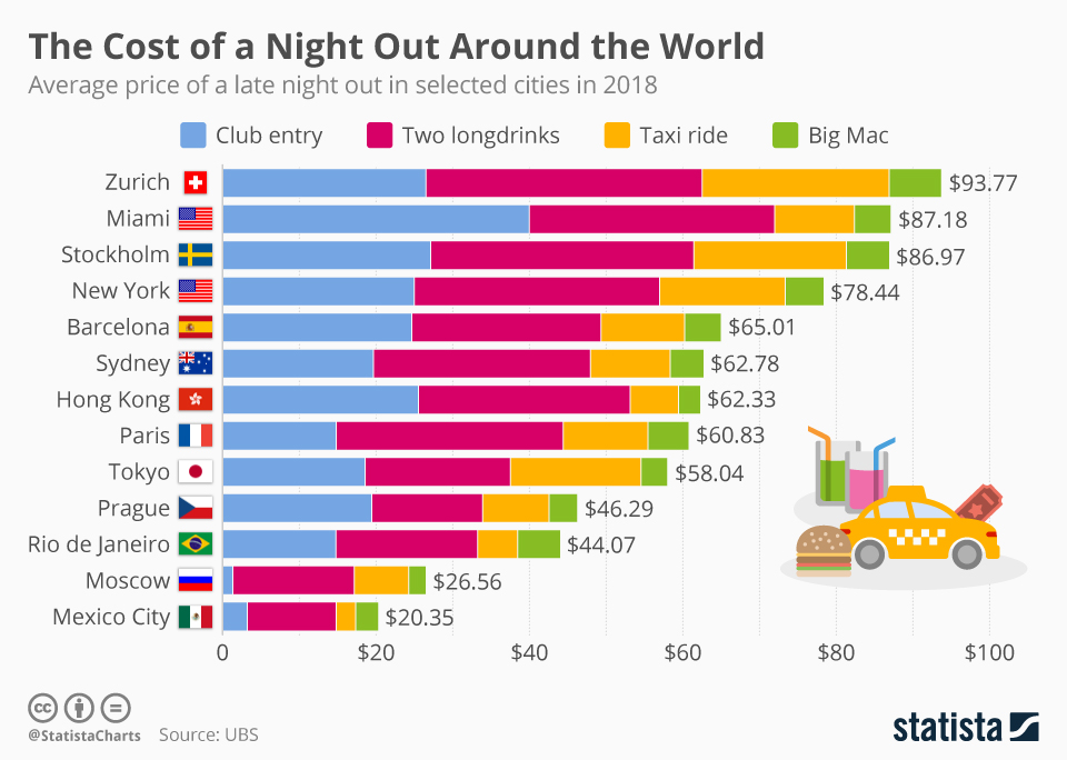
The designer chose horizontal stacked bars to show the average price of a party night. There is one bar per city. The length of the bar represents the total cost of the night.
Each bar is segmented into parts that represent the cost of the items purchased during the night: club entry, two longdrinks, a taxi ride and a Big Mac.
The bars are usually the best choice for comparisons. we can easily compare the total price between two cities even if those cities are not next to each other on the chart. It is clear that a night out in New York is more expensive than a night out in Paris. However, I find it more challenging to compare the price of items. Are the longdrinks more expensive in New York than in Paris?
My goal
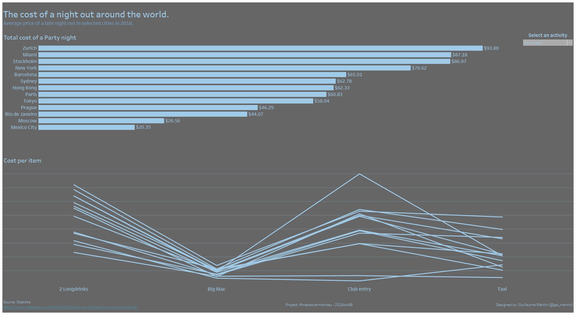
In my visualization, I want to improve the comparison of the price of the different items in each city. I also want to keep the comparison of the totals easy.
The dataset has two categories of activity: a Date night or a Party night. I am going to show both of them.
My visualization
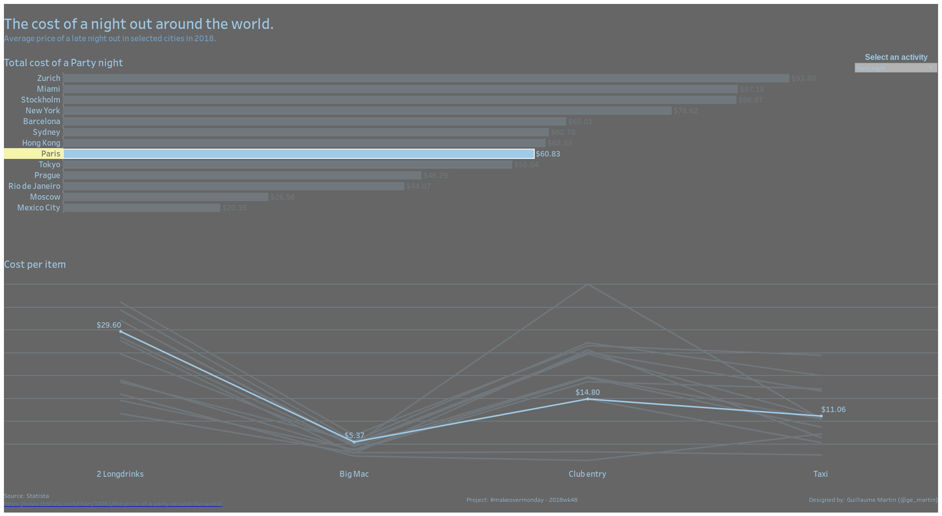
I keep the horizontal bars to compare the total price per city. Below the bars, I am showing a parallel coordinates graph. On the X axis, we have the items purchased during the night. On the Y axis, we have the cost. There is one line per city.
There is a filter to select whether we want to see the data for a Date night or for a Party night.
When we click on the bar of a city, the line in the second graph is highlighted, making it easier to compare the price of the items in this city with the price in other cities.
The interactive visualization can be seen here