This week, we were offered to work on a visualization made by The Gardian to compare their predictions on the Premier League results for the season 2017-18 and the actual final standings.
The original visualization
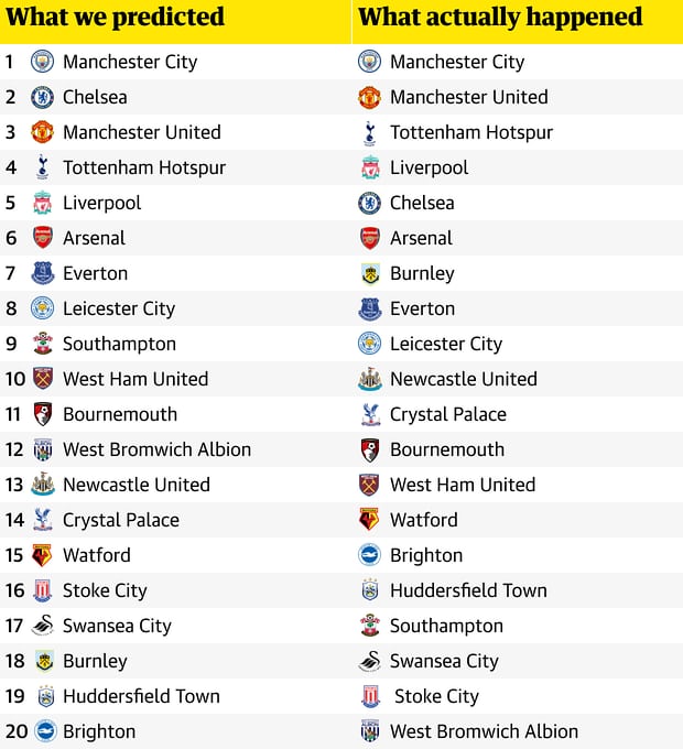
The Guardian used a simple table with two columns. One columns shows the predictions and the other one shows the actual rank at the end of the season. This choice make it hard to visualize how ranking changed from prediction to actual.
My goal
I want to show the evolution between the predictions and the final results.
I want to see where are the biggest surprises and in which part of the board are the largest differences.
My visualization
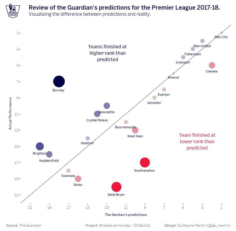
I chose a scatter plot that compares the predictions with the actual results.
There's a reference line that shows prediction = actual. Any team that is on the line performed as predicted. The team that are over the line performed better than predicted and the teams that are under the line performed worst.
The size of the marker shows the absolute value of the difference between the prediction and the actual result.
The color of the marker shows the difference between the prediction and the actual result where blue is a positive difference (the actual standing is higher) and red is a negative difference (the actual stabnding is lower).
Here is the result: